
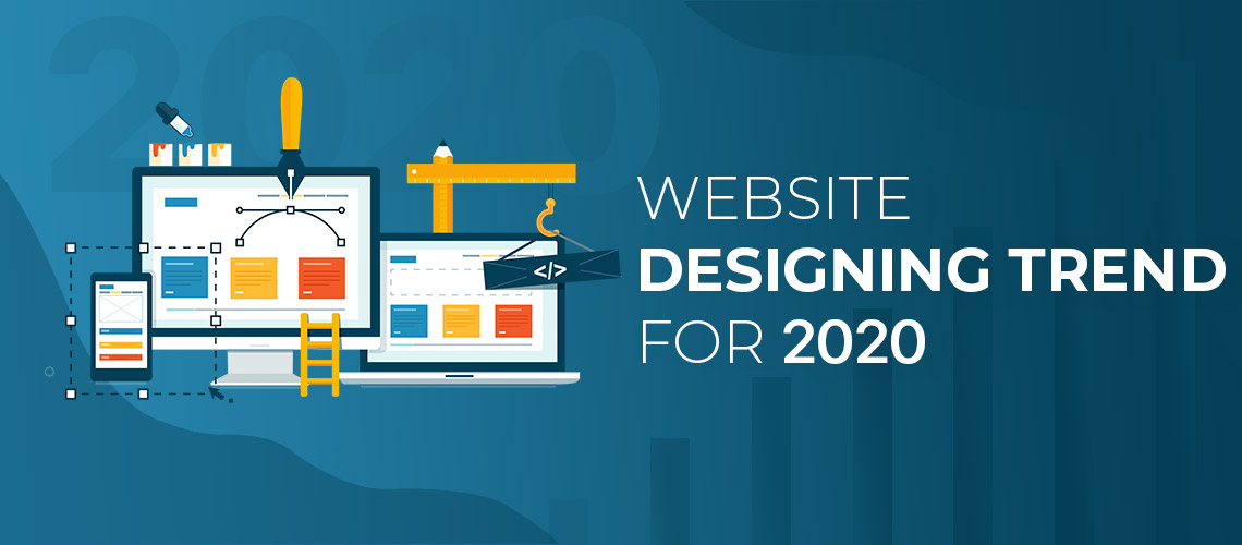
Website Designing Trend for 2020
Web design trends are always changing. A new crop of design trends emerges every year from last year's work. Some trends are enjoyable, some inspire, and some make our eyes moved. New grows old, and old become new.
Change is one of the most satisfying and challenging facets of a web design career. The Taste and technology advancement keeps our skills acute that allows us to stay in touch with the people we create.
As a leading website designing company in Dubai we have identified some emerging design trends for 2020 and want to share our vision, so you can succeed online. In this article, we are going to talk about the top web design trends that are popular now, in 2020 and will continue to be on trend in the coming future. Over the last couple of years, we have successfully defined web design trends that have proven to be efficient for our customers. So, we will suggest you to follow these trends to make your website a better place.
Frosted Glass Effect
The effect of frosted glass is the semi-transparent and blurred appearance of the elements behind the other. It was first introduced on a large scale for the Windows user interface via Windows Aero. Apple and major app developers began to adopt it later for their OS and apps as well.
Dark Mode
An adjustable color scheme of web apps and websites that is conscious of your native OS settings and that gives you either a light or a dark site theme.
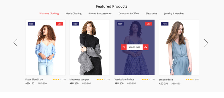
Asymmetric Layouts
Think about it…
The majority websites are grid-based, obsessively structured bland fields that have been secure on the agenda. Not that well- organized homepages are a sin, but asymmetric systems will be embraced in 2020 with a brave attempt to flourish individuality, Brutalism and an imbalanced enjoyment and excitement.
In particular, personal websites are rapidly bringing this concept to titan levels. Broken-grid structures are particularly attractive because of their perceived simplicity and stubborn assertiveness.
But here it is important to tread carefully.
Brands with significantly large amounts of live content can find deploying asymmetric design onsets a confusing web experience for their readers. Therefore, such a company would do well to rethink the concept and turn to a more appropriate and personable design – if they want to keep users happy.
CSS Grids
This is a trend in web design that came about to resolve the question of evergreen architecture. In recent times, online brands had to determine between making either mobile or desktop websites. And designers have had to customize those sites to identify what device a visitor is using, so that the latter can be routed to a version of one site that fits the size of their device.

And while since 2017 it has been official that more people are now browsing the web on their mobile devices than on desktops, a smart CSS grid provides a genius alternative to stretch one site into multiple versions to suit the screen size of a consumer (instead of opting for mobile web design).
As previously mentioned, mobile web traffic volumes have already surpassed traditional desktop traffic in most key markets around the world. The fact that Google itself continues to show a strong commitment to mobile-friendly websites almost say it all.
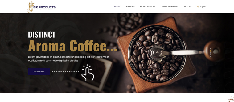
Sophisticated 3D Graphics
Big, cinema-like videos and graphics. Some of them are real 3D renderings and others are videos that play interactively with your scrolling. The common reason for this is to catch your attention through the complexity of online media.
Horizontal Scrolling
Horizontal scrolling of items that would otherwise break into the next section. Particularly on the smartphone, where there is limited horizontal space, we see an increase in web designs using non-breaking lists that need to be scrolled horizontally for more content.
Microinteractions
Small animations and subtle feedback patterns of interaction. Microinteractions itself are already present on a mass by default, but clicking on the submit button transforms towards a loading bar showing progress, pull-to-refresh interaction or clapping of a medium post and showing a good animation are Microinteractions that take more account than a typical color change.
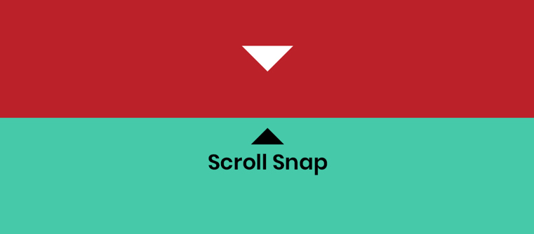
Scroll Snap
Scroll snapping allows to set the scroll location on certain things automatically after the user has scrolled the content. It gives the user a clear focus without cutting content.
We at Royex believe that website should comprise of all the needed elements & should be technically built well to make it a tremendous UX. Visitors will enjoy and respond well if your website is user- friendly. You should take care of your looks so that it should not affect the image of your business. If you are interested in our UI/Ux, Graphics, Web designing services, then kindly contact us at [email protected] or call us at +971-56-6027916. Royex, the leading website design company in Dubai can help you create effective and eye-catching websites that will increase your business image and give your business a high conversion ratio.