

UI Design Trends for Mobile Apps (2025 Edition)
Royex Technologies is the leading Mobile App Development Company in Dubai. We are a foremost brand in the mobile App development industry in all of Dubai. We have worked and are still working for numerous mobile apps and this has given us the necessary experience and technical know-how in UI Design for mobile app. Over the years, we have observed that people’s taste change with time so this article would be a little different from the one we published last year. Designs from over 3 years ago have been almost phased out because of the evolving taste of humans as well as improvement in functionality. For this reason, we have taken the time to put together a list of the top 9 UI design trends for mobile apps for the year 2018:
1) 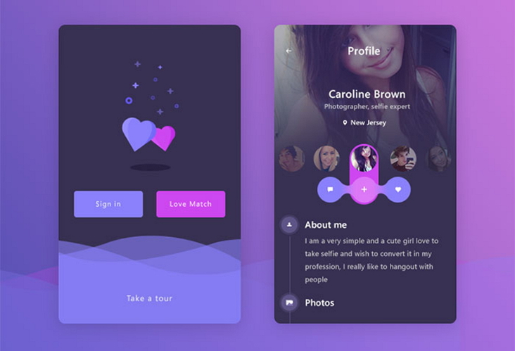
A sense of space, as well as amazing aesthetics is enhanced by the overlapping fonts, colors and graphics. That’s the reason many designers have used a distinct mobile application UI design elements in recent years. Also, the overlapping of these same elements, blending with shadows can make it a lot more impressive visually.
2) Color Gradients
Many designers over the last few years have adopts color gradients in their design process while designing things like logos, buttons or background for the interface of the mobile app. The reason is because even one single shade has the capacity to offer high level ranking and draw a lovely picture while combining it with different graphics and color gradient.
3) Opacity
Adjusting transparency can have the same component giving you different effects. That said, the opacity can be adjusted while designing the phone apps. A design can definitely be made a lot better by adjusting the opacity level.
Also, you can create a glass quality for app interface elements by adjusting the transparency settings so that most designers use this approach in their mobile app logo designs.
Not with standing how much opacity effects you infuse into your design, transparency setting put into distinct elements will definitely have a rise in popularity for the following year.
4) Simple geometries and curves
When comparing with a changeable and complicated UI design style, natural and simple design styles have been adopted by designers. For instance, an interface covered with different colors, buttons, graphics, animations, pictures and other difficult components, a phone interface that has just a simple curve, button and geometric could be a lot more productive for functionality.
5) Strong font or shade contrast for better readability
Designers could also benefit a lot from an excellent user interface pattern for seeking attention to his/her work. For instance, they can deliver a progressive system and space to their interface just by adding different font size, type or orders. You can also add a sharp contrast and ensure the whole design aesthetically amazing.
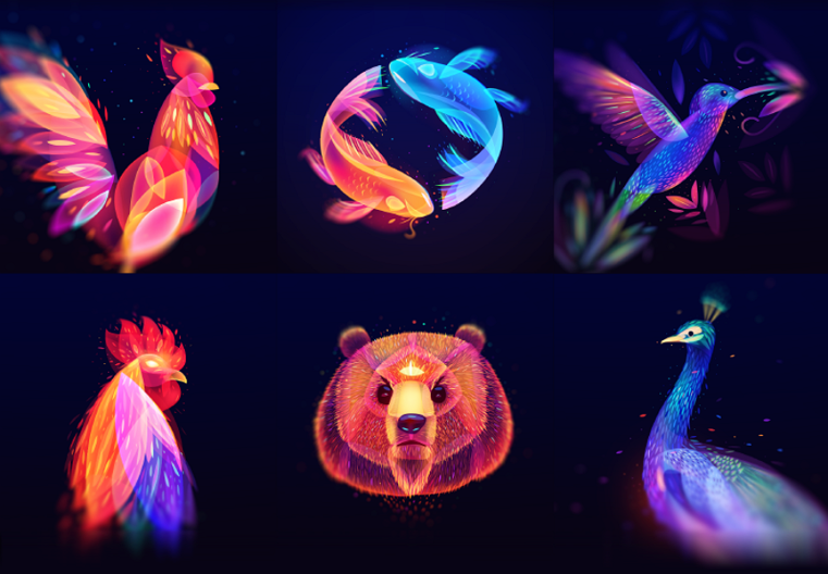
6) Custom illustration interfaces
Custom illustration played a key role in the UI designs of mobile app in 2017 and is still famous in 2018. An app could be made a lot more impressive an distinctive by adding different illustration styles, paper cut style, simple style, hand writing, and the very popular painting style illustration. Mobile apps are made a lot more impressive by these.
7) Functional animations and interactions
There is a positive impact added by creating animated or interactive icons, fonts, buttons and photos of a mobile UI interface thus offering a lot more pleasant experience.
Micro-interactions enable users to make use of the apps, and get an almost immediate feedback from their interaction. That is unquestionably a decent pattern which planners ought to pursue to finish their mobile application UI structure.
8) Voice-activated interfaces
User experience and operations are made a lot simpler by voice-activated interfaces on mobile apps. Similar to what you get on Siri, you can log into a voice-activated mobile app with voice orders in place of having to click on popular apps.
Mobile app developments in the future will have a lot to do with fingerprint-activated interfaces and voice-activated interfaces
9) Mixing different trends will also be a trend in 2018
In most cases, UI designers will mix 2 or 3 or even more methods such as overlapping effects, functional animations, color gradients, etc thus creating a better effect. Based on this, it is expected that in future, there will be a mixture of different mobile app UI designs.
10) Dark Themes
Dark mode and dark themes are going to be all the rage. Not only does it look good, but a dark theme also reduces strain on the eye.
In the latest operating system of both Apple and Android, dark more can be enabled system-wide. This just proves the demand for dark mode is quite high and it's only logical you enable a dark mode for your app.
Mobile phones with OLED screens can conserve battery life when using a dark mode by reducing the lighting of pixels.
11) Buttonless Design
Modern mobile manufacturers are constantly aiming to increase the screen-to-body ratio to ensure maximum immersion and engagement. Bezel-less displays have been the trend for mobile phones and as a result, the buttons on the bottom of the phone have also taken a back seat.
The lack of buttons means for mobile app designers means gesture controls to navigate around the app enabling the focus to be on the content rather than the buttons.
Mobile App UI designs can be as changeable and complicated as the user wants it to be. So, we have identified these 11 UI design trends for mobile apps that would really work for you. As a creator or designer, you are supposed to stay ahead of the game by being creative.
This way, you would easily accomplish just about any UI design with unique interfaces and amazing user experience.
We will always endeavor to innovate fresh ideas in mobile apps interface design. If you check our portfolio, you will find similar apps in different forms. We enjoy trying out new things to create new designs and ensure we keep creating efficient UI.
Why Royex Is the Right Company for Mobile Apps Development
Royex has built a strong name by creating apps that feel smooth and clear for users. Many companies prioritize style over substance, but Royex goes further. We aim to understand how people think and navigate through an app. This gives them the power to build screens that guide users without effort. Our team researches the local market to make sure each app suits the habits and preferences of its users. This is why our work stands out and feels fresh.
Another reason we are trusted is our way of handling each project. We remain connected with clients and ensure communication is always open. We take time to explain every step so the client feels in control. We listen to ideas and adjust the plan when needed. This creates a calm process where both sides know what to expect. Our clients trust us because we prioritize honest, straightforward communication over empty promises.
Many clients want a Mobile App Development Company in Dubai that delivers both great looks and reliable functionality. We have shown again and again that we can do both. Our apps load fast, look clean, and guide users with a simple flow. We avoid clutter and build with care. This is why many brands choose them for long term projects. We focus on creating work that transcends trends and brings meaningful value to businesses and users.
FAQs
1. What makes overlapping design elements a trend in mobile UI?
Overlapping shapes, text, and graphics create a sense of depth and space. In mobile apps, this gives a more layered look, making the screen feel more dynamic rather than flat. According to Royex, this overlapping of fonts, colors, and graphics helps enhance the visual appeal and gives designers room to play with shadow and transparency. It’s not just about decoration — overlapping can guide users’ eyes to important parts of the screen, making the app more intuitive.
2. Why are color gradients still popular?
Gradients bring richness to an app’s interface. Royex points out that designers favor gradients in backgrounds, buttons, and logos for their ability to create pleasing color transitions. Beyond aesthetics, gradients help differentiate UI elements, making it easier for users to understand which parts are interactive (like buttons) and which are static (like backgrounds).
3. How does adjusting opacity improve UI design?
Opacity, or transparency, lets you layer interface elements without them clashing. Royex points out that by tweaking transparency, designers can create a “glass-like” feel: elements appear as if they’re floating or made of frosted glass. This effect adds elegance and softness to the UI while maintaining readability and functionality.
4. Why use simple geometries and curves in UI?
Simple shapes and curves make a UI feel clean and friendly. According to Royex, using these geometries helps avoid clutter and improves usability. Curves (rather than sharp angles) feel more natural to the human eye, and they can guide users gently through the interface. Simple geometry also supports faster performance and less visual noise.
5. How does font contrast help mobile app users?
Good contrast in typography makes text easier to read, which is vital on small screens. Royex focuses on combining impactful font sizes with strong color contrast to guide attention and support clear reading. By making text stand out precisely where you want it to, you improve usability — especially for users who may struggle with small or faint text.
6. What role do custom illustrations play in UI design?
Custom illustrations give an app personality. Royex mentions various illustration styles — like hand-drawn, painting-style, or paper-cut style — that make apps feel unique. When done right, these illustrations help communicate ideas more clearly than plain text. They boost the user experience while supporting and reinforcing the brand identity.
7. Why are micro-interactions important?
Micro-interactions are the tiny animations or responses you get when you tap a button, swipe, or scroll. In Royex’s list, they mention how functional animations provide instant feedback, which makes the app feel more alive. These small touches guide the user, confirm their actions (“Yes, I saw you tap that!”), and make the experience more satisfying. They also help with usability: rather than guessing, users know what their action did.
8. How does voice-activated UI change mobile app design?
Voice-activated interfaces let users interact with the app by speaking. Royex notes this as a trend that simplifies navigation and input. By using voice, you reduce reliance on typing or tapping — this is especially helpful for accessibility (for users with limited mobility) or when users’ hands are busy. But voice UI doesn’t replace touch — good design often offers both options.
9. Is mixing different UI trends recommended?
Yes — in fact, Royex considers mixing trends itself a trend. Using techniques like overlapping elements, gradients, and custom illustrations, designers craft interfaces that feel lively and engaging. But it's important to balance: mix too much and the UI can get confusing, mix too little and it may feel bland. The key is selecting trends that complement each other and align with your app’s purpose.