
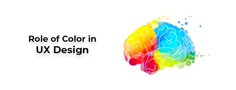
Importance of Color in UX Design
For human beings, color is known to be an important visual experience since it is the simplest element to recognize when it comes to experiencing new things. Our visual senses are flooded by constant optical stimulation any moment we open our eyes, with surrounding sights vying for attention.
Colors serve as an effective tool for knowledge which may be used to support the general cognitive structure of humans. We can trigger optimistic emotions and actions within ourselves by using the right collection and correct placement of colors.
It is understood that colors have physiological and psychological features, since various colors have different associations that differ across diverse cultures.
This reality is incredibly relevant for every company's UX architecture since the power of a brand is highly reliant on this unique aspect. Color is one of the many marketing strategies utilized by product marketers to develop, retain, and change brand perceptions in the minds of consumers to communicate their product's significance.
Each product company's brand includes its application or website emblem, colour and overall interface. Colors can increase memory efficiency by generating an emotional impact due to the different symbolic associations that each color carries through cultures.
Colors may also improve the efficiency of any program by focusing end-user focus and at the same time delivering an enhanced user experience by generating an environment that influences positive emotions. The thorough choosing of fitting colors will maximize the optimal connections and a task's effectiveness.
A well-considered color palette can improve a design, whereas a not-so-well-thought color palette can diminish the experience of users and conflict with their ability to effectively access a website or mobile app.
It is not possible to ignore the emotional effect of interface shades, including their classification, symbolism and choice. While certain colors in the UX style are uniform, other colors they are paired with may have a significant effect on the understanding of users.
How Humans Perceive Color
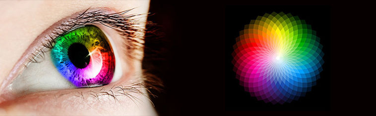
The foundation for all visual information is the eye. Color is light carried through wavelengths absorbed by the eyes and transformed through the brain. Light can be broken down into a spectrum of five different colors: red, orange, yellow, green and blue.
Red has the longest wavelength, while the shortest wavelength is the color blue. All colors in the spectrum, excluding red light, are consumed by an object that is red in appearance. This unabsorbed light is reflected back from that object into the eyes .
It moves to the brain from here and is perceived as red. The approaching light on the retina, which comprises two special kinds of photoreceptors, is centered on the lens of our eyes.
They include: monochromatic vision rods during nighttime and color-sensitive cones that need a larger degree of light intensity to be initiated and are thus used throughout the day. These cones and rods permit us, respectively, to see color and light.
Three forms of cones exist: type I associated with blue, type II associated with green, and type III associated with red. These three shades are a mix of other colors. We see an apple, for instance, and think of it as red in colour.
So, the apple is struck by sunlight. The chemicals in the apple's surface obstruct certain wavelengths, but the other reflected wavelengths move into the pupil and excite the cone cells at the back of the eye. The brain transforms this code into a "red" perception.
How Does Color Influence Emotions
In order to understand color psychology in UX design, one must also analyze whether colors lead people to experience emotions because of their decision-making phase of visiting a website or selecting a product.
In standard day-to-day life, colors are so common that it seems incomprehensible that they are not correlated with particular perceptual units. Thus, an entire network of these units is triggered with the impression of a colour.
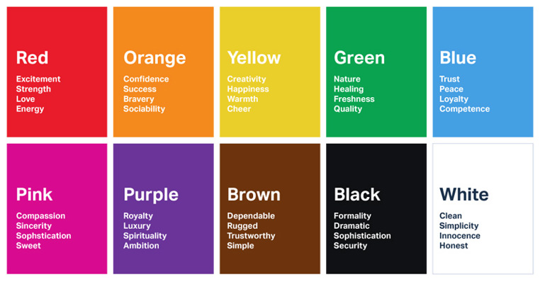
Red, for example, can normally attract the eye as it activates cognitions such as blood, hot, risk, excitement, warning, mistake, whereas green will bring cognitions such as nature, serenity, hope.
The colors identified by psychologists are warm (red and yellow) and cold (blue and green) colors. The distinction between warm and cold shades, though, is relative; for example, yellow is perceived as colder than red when red and yellow are matched together.
White, black and gray are seen as shades that are neutral. Because color experiences vary from person to person, it is unreasonable to presume to know how color is experienced by someone else.
Unlike someone else, one person's perception with a red color may be viewed uniquely. Both human actions and human physiology are affected by colors.
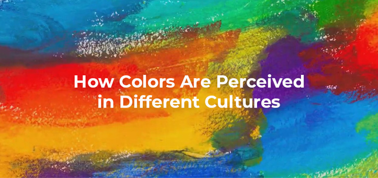
How Colors Are Perceived in Different Cultures
Looking at the cultural effects of the color palettes depending on the target audience for the product helps designers.
Specific affiliations vary slightly at the person level, however there are certain color coding associations that are formed as part of the community.
Social contrasts have been identified in the senses of colours and comparisons. In India, for example, Hindus consider orange the most sacred color, although in Zambia, citizens do not even consider orange as a distinct color.
Thus, knowing the colors are preferred by people is critical for UX designers. Brands and their packaging are usually explicit color blends.
Color combos are known to be collectively bound for particular structures and conventions of conviction. Black color in Western society reflects death and grief, while it represents health and stability in Far Eastern culture.
As a consequence of the individual color pairings, the blend of colors chosen for objects, logos, products etc. can convey significance.
Role of Color in UX Design
Color theory should be known to every UX designer. Color theory is comprehension of the dimensions of the color wheel and color. The color wheel gives us an idea of the harmony of colors and what colors can be mixed to produce a significant visual effect.
The color dimensions are hue, saturation and value. Colors control consumer focus and show order if used appropriately. The fewer a color is seen on a daily basis, the more it can attract the attention of the customer.
The combination of such a large number of colors makes the presentation look cluttered, confuses the customer, makes tasks more unpredictable, increases errors and reduces productivity.
With respect to the paradigm of cognitive psychology, nearly five unique colors are suggested. The interpretation of a color is perceived as an initiation of a cognitive unit in this way. The conscious mind can be used as an indication of units that are triggered.
Therefore, the reduction of the quantity of colors when used as data communication coding as well as the consistent use of color will support users' cognitive performance.
Studies have shown that our personal interests, experiences, education and cultural distinctions have an effect on our color choices. When one creates a UX schedule, this data may be treated as variables. Through selecting the right colour, investigating these aspects will allow a product to stand out.
The 60-30-10 rule is a theory used by virtually any artist to create aesthetically appealing and adequately balanced color palettes. It's a classic rule of decor that helps to build a color palette for a room. It specifies that 60 percent of the space should be a primary color, 30 percent should be a secondary color, and a highlight should be the last 10 percent.
In general, UX models or advertisers can use color for product advertisements and commercials. In this way, color becomes an integral part of the visual value of a company and the value generated from this "look and feel" contributes to brand awareness and logo.
Like a purposely chosen brand name, color conveys an intrinsic sense that becomes important to the identity of the brand, enabling buyers to use color symbols to evaluate goods and make a choice.
Apparently, recognizing the role that color plays in ads becomes more urgent as technical developments in strategies to expand the diversity of user contributions in color and consider more innovative color applications, such as more powerful mobile device displays (e.g. smartphones, tablets) and different color options for consumer-packaged items. Over time, the relevance and usability of color options seems to have advanced.
Final Words
Color is a medium that, by its richness and elegance, helps objects to become more complex and meaningful. Color is more than just an aspect of beauty.
When our eyes sense colour, they attach to the brain, which sends the endocrine system signs that activate hormones responsible for mood and emotional changes. Color activates our perception in simplistic language, and is closely related to the brain, where it triggers feelings automatically.
As any single color has a special significance, color can influence daily actions as well as activate emotions in individuals. For enterprises, the meanings associated with various colors are relevant since the methods used to convey the brand picture are processes of transfer of meaning.
In the tool stack of every artist, color is an integral instrument. Because interfaces have to consist of at least two separate colors, in order to be friendly and hence support the cognitive efficiency of the end user, it is necessary to maximize color variations and color themes.
Cultural aesthetic comparisons may change product evaluations since several color affiliations are uncovered. In addition, globalization and the growing dominance of Western society have had a significant effect on the definitions of cultural colour, and cultural interpretations will also evolve with time.
I assume that the adequate usage of colors in the design of numerous apps and organizations will have a profound effect on the overall user experience. Cultural, technological, social, and other variations render it impossible for corporations to define internationally appealing single brand picture strategies.
Global enterprises therefore need to define a brand image plan as well as a specifically defined communication campaign that generates and preserves the ideal image across cultural boundaries in the mind of the consumer.
At Royex, we try to be up-to-date with all the latest UI and UX trends and incorporate them in our work. If you are interested in our UI/UX, Graphics, Web designing services, then kindly contact us at info@royex.net or call us at +971-56-6027916. Royex, the leading website design company in Dubai can help you create effective and eye-catching websites that will increase your business image and give your business a high conversion ratio.