
How to Increase Cart Page Efficiency by Improving UX Design
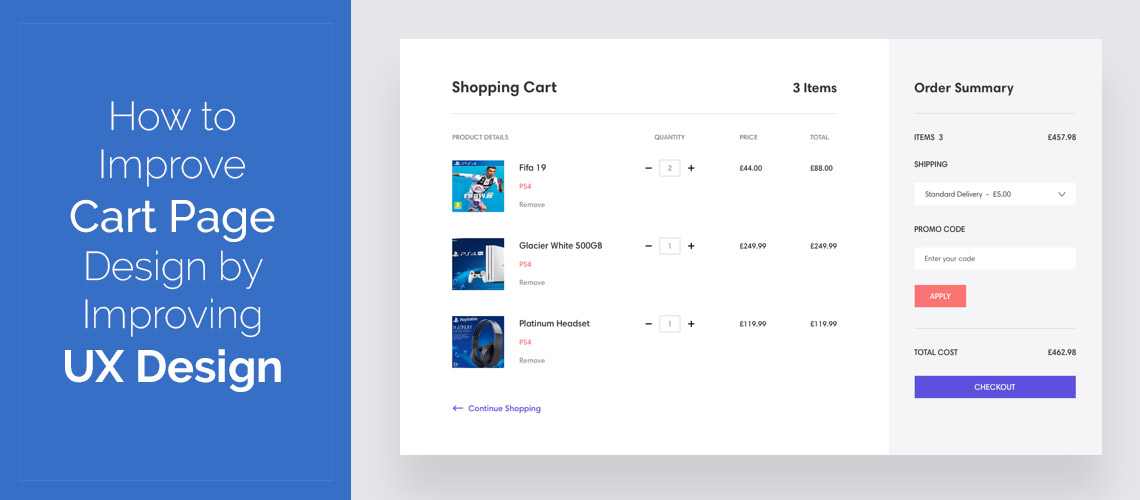
What is the perfect way to design a cart page for an online store? Most designers believe that providing no clutter on the cart screen is the best idea, because the customer can concentrate on shopping. On eCommerce sites like eBay, the strategy is commonly used.
Some models argue that the cart is the best spot to cross-sell or upsell products, because the customer is still inspired to purchase it so it's super simple for him to add that commodity to the cart to purchase it immediately. The strategy's perfected by Amazon.
There are rules that govern how to create a particular element in eCommerce. One of the easiest reasons is to always put the logo in the top left corner of the site page and link it to the homepage (this concept is so effective that it applies well beyond eCommerce).
Another rule is that the navigation links are either at the top of the web page in the form of horizontal text blocks or concealed behind a hamburger menu. Navigation must always be present and accessible and even if you run some type of fancy fashion store, you can hide it behind a hamburger menu, compromising usability for the sake of aesthetics. These rules, even though simple, always work. There is simply no question about it.
The main problem begins with the cart. There are no specific guidelines about how a cart page should be designed. It is common to see designers becoming so confused that they end up asking consumers what they want, and then making the projects over and over again, so the consumers do not know what they want.
In reality, it's not the clients' fault. Designers are accountable for the website appearance and design. They should know the proven patterns and build them themselves. The thing is, some of these trends become redundant so easily that they don't even realize.
Nowadays, the users are moving from desktop to mobile so quickly, that we can reconsider everything and create mobile-first eCommerce. Rather, many apps are also simply downscaled copies of desktops on the smartphone. And this is a problem.
The new way of working is to build an online store's mobile edition, and then upscale it to the web. Everywhere, from a website to operating system architecture, we can use mobile-first strategy.
Simply take a look at Google's first-ever web indexing, or how Windows has improved from versions 8 to 10. In its iteration of mac OS — Mojave — even Apple, with its stubbornness of distinguishing web and smartphone, has launched a redesigned app store close to its iOS edition.
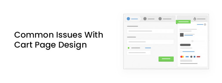
Common Issues With Cart Page Design
Nearly every cart appears the same: a cart icon in the top right corner of the website page, a badge with a warning regarding the amount of products in the cart and, after clicking on it, the customer is guided to another cart page, and from there they continue to the checkout. I see the basic problem with the cart here.
To go through on the way to the checkout is just another irritating move. The cart seems more of a barrier, reducing the rate of transfer, rather than becoming a helpful shop buddy that would improve it.
I assume that the three key factors behind this:
Friction in the flow
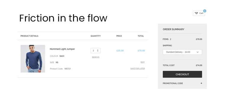
Checking your cart is typically a complex process, so you are redirected several times. First, review the final product attached to the basket, then return to shopping and finally return to checkout.
A sidebar cart is a great but also not the ideal option. Then we have handheld devices where it's a really challenging challenge to hit the cart icon located in the top right corner on displays greater than 5 inches.
Checking the cart should be a simple enough task. Users will be able to test seamlessly what's inside their cart, which will have fewer frustrations moving through the checkout process.
Limited Functionality

We may use some features to link the cart and build an easy-to-access place and handle items.
There are still several options from a company standpoint to using the cart to raise sales without becoming pushy. The current page design feels restrictive with limited functionality and that needs to be changed.
Lack of shopping experience
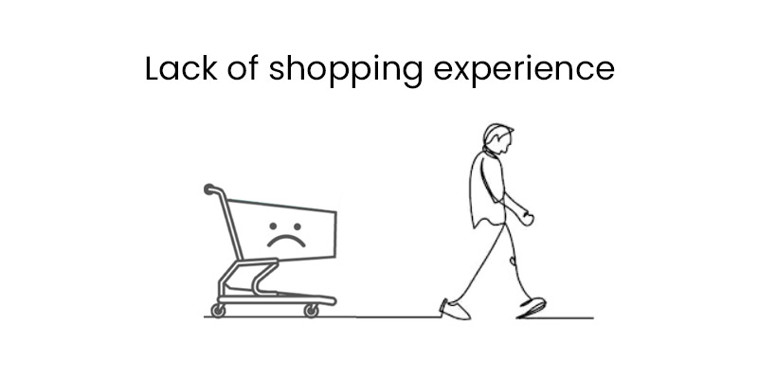
In certain instances shopping online doesn't remind us about shopping. More frequently than not, there is a significant contrast between an online site experience and one in a brick and mortar shop. In these fluid interfaces, we can change this robotic feeling by adding a little human touch-animations and complete control.
Solutions to the Cart Design Issues
Here’s what seems to be a plausible solution to the existing cart design issues:
Designing the cart keeping mobile in mind
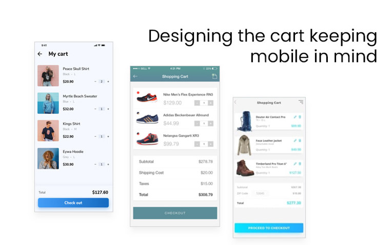
Forget about current trends, and reconsider the problem. This time considering mobile-first strategy. The easiest approach to render it available is to make it accessible with the thumb.
What if this is the way we built the shopping cart? Thanks to 3 conveniently switchable modes, it does not disrupt a user's flow: invisible — when none is in the cart, top displayed — when there are products in the cart but you see just item count and size, and an extended view when you only pull up the cart to see all the things in it. It will be pretty convenient for those who do a lot of shopping online. Anything that is beyond thumb scope. Imagine how easy it will be to buy this way on eCommerce websites
Redesigning the whole website is often too difficult. But by incorporating a bit of human interaction, we might have "moving keys" and improved animations for the consumers.
Users will therefore achieve the real-life shopping experience. Simple and elegant.
Multicart
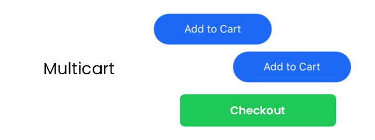
Is there really the major gap between a cart and a shopping list? Perhaps users can create a ton of lists, and then purchase a whole set with only one click?
Imagine purchasing office supplies for a variety of businesses. You can search an online store with a different list for each business and add e.g. 10 pens to the "Company1" and "Company2" lists, and then a whiteboard to the "Company1" and "Company3" lists, and then complete your shopping in one move. Even consumers get easy shopping at once.
Dynamic Comparisons
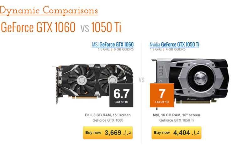
That notion goes a little deeper, it ties "compare" to "cart." When you add an item to your cart, it's matched automatically with others. So let's presume you're looking for a graphics card, for example: you add one to your "wallet," and then start searching other graphics cards that are automatically similar to the one you've picked. No need to link every product to a comparison list. Using your cart you can do so with ease, and match your chosen object to each object of the same group.
Swipe to add to cart
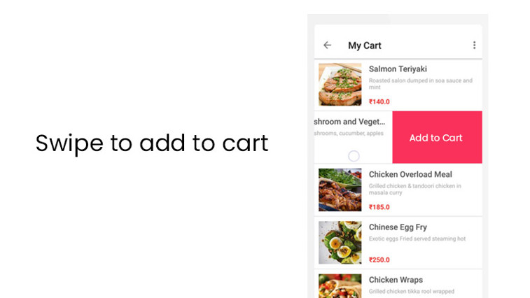
Going back to the human contact, we might show present items as a horizontal list and encourage users only by swiping to "break" products into the cart. That would reduce the need for CTA's, and establish natural motions where users literally "place" things in their cart.
Splitting the bill in cart
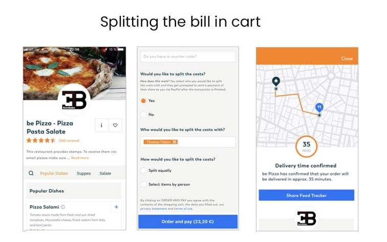
We purchase stuff online with our friends several times, but still we have to divide the bill later. That causes needless mess and issues. Here we're proposing an idea that you might break the bill at the order stage and pay in parts! The great thing about a service like this is a list, where everybody knows how much they have to spend and who else needs to pay. Everything that is ordered is just after everybody pays for their item.
We at Royex believe that websites should comprise all the needed elements & should be technically built well to make it a tremendous UX. Visitors will enjoy and respond well if your website is user- friendly. You should take care of your looks so that it should not affect the image of your business. At Royex, we try to be up-to-date with all the latest UI and UX trends and incorporate them in our work. If you are interested in our UI/UX, Graphics, Web designing services, then kindly contact us at info@royex.net or call us at +971-56-6027916. Royex, the leading website design company in Dubai can help you create effective and eye-catching websites that will increase your business image and give your business a high conversion ratio.