

Best UX Practices For Magento Ecommerce Store
Everyone depends on the web for information, be it shopping online, looking for a brand, or a product review. This renders online presence one of the most sought-after ways by which an individual communicates knowledge and a critical way of establishing brand reputation.
With the ever-increasing rise of internet shopping, gaining and keeping clients is becoming a problem for e-stores. It is important to look for cohesive user experiences to develop a client base and to raise traffic on your site in order to achieve higher engagement and create trust with users.
Here are the best UX practices to follow for your Magento eCommerce store.
Website Navigation
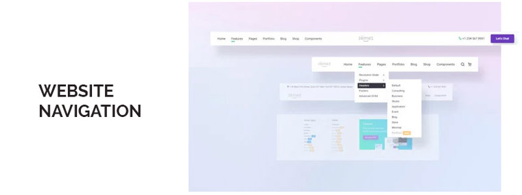
Intuitiveness is essential. It improves 'site-stickiness' as a person easily discovers what they are searching for, with a limited amount of effort and by not getting stuck in a vortex of navigation and sub-navigation. Take care to arrange the navigation in the proper hierarchy and even in relatable nomenclature. Common terminology that consumers are acquainted with inside your context would be what you label your categories and sub-categories.
- Keep the navigation at the top, preferably. A technique that is sometimes used is Sticky Navigation.
- Keep the quantity of sections to a minimum, with the most important ones easily noticeable.
- Categories and subcategories should always be linked.
- Using a mega menu to classify categories with many sub-categories.
Easy to find content

Make finding what users are looking for swift and easy. Site search has a significant influence on the overall usage of the site, increasing sales and retaining consumers. Include a search bar for all web sites, that provide simple tools such as auto-completion to make things simpler. Also identifying the closest potential word depending on the feedback of the customer helps enhance the overall quality of the search.
To narrow down choices, use filters and sorting methods for consumers so that they reach their preferred product quicker. Separate and build filters for your items based on form , color, height, purpose, brand, price, etc. In consumer choices, sorting based on costs, customer feedback and ratings often play an important role.
Using the right images and videos

In order to market your goods and services, try not to use stock photos and individuals. If they may respond to a picture of your product being used, the customer is likely to connect further with your business.
Be sure that all the pictures are of the excellent quality and that they are not blurred or poorly edited. To compensate for the absence of 'touch and feeling', consumers tend to see numerous client reviews. The feeling would render the video showing of items much more relatable.
Customers read the product/service reviews, consumer recommendations and client suggestions. As people are more likely to read them for credibility, use quotations to testimonials to hold them correct. In shaping transactions, contextual data plays a major role. Real-life feelings sell higher, and it happens a lot in e-commerce.
Mobile-first approach
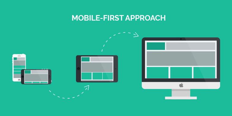
- More than 75% of smartphone consumers have made an online payment via their mobile device.
- Inside a physical store, 80 percent of shoppers use a smartphone to look up product ratings, check costs or search alternate market locations.
To connect with a brand, a lot of people use their mobile devices because it's convenient. And, if the desktop version experience is fine, that doesn't mean the same applies for smartphones. Mobile UX is a completely different scenario.
- To make the experience natural, use native smartphone features.
- Account for the shortage of space and share only the information that is very important.
- Disable features that, like auto-correct when filling addresses, can be a deterrent while entering data.
- Offer consumers the opportunity to store sensitive details such as shopping cart items, emails, etc. This often encourages users to enter fewer data on potential visits, particularly because it can be difficult to enter data , especially on the move.
- To complete a purchase, reduce the amount of clicks.
- Keep the experience smooth if the consumer moves from one computer to another.
- For inputs, use the required keyboard. Eg. Keyboard numbers for dates, OTP, credit card numbers, etc.
Design that facilitates sales
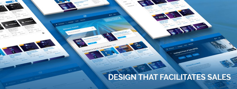
The several aspects of your ecommerce website design that you must take into consideration:
Layout- Pay attention to the website's general look and feel as the style of the page can dictate the way the brand is viewed by a customer. Crowded and cluttered websites seem to be less utilized, so it is challenging to find what one needs. Made use of negative spaces and the proper color balance. When designing your e-shop, a clear design framework for typography, colors and patterns would play a positive role.
Products - Make sure that the products inside the portlets in which you display them are clear and visible and that the variety provided by the store is seen in the first fold. Provide comprehensive explanations of the goods to help purchasers appreciate the commodity. This could be by supplying them with the details in small bits and further describing it on request using the feature of expand and collapse (accordion). This tends to reduce the abundance of results, and your client won't feel overloaded.
Intuitive positioning and callouts enable consumers to explore goods and categories. Categorize them as fresh, best-selling, famous, recently bought, etc., as many consumers mostly only search and, in particular, do not aim for anything.
Content - Ensure that the user is able to quickly navigate the data on content pages such as shipment choices, refunds, distribution monitoring, etc. to create trust to enable them make a more educated choice. While policies and T&Cs are also important, it's better they remain short and truncated. Show more often when triggered by the client.
Forms - Keep the forms concise and relevant. Simplify them and speed up the operation of automation/functionality. Ask only for specific fields that are needed to complete the procedure as per regulations. Making suitable recommendations where, due to lack of clarification or interpretation, the clients can be reluctant.
Tweaking and maintenance

Your journey doesn't stop when your store goes live . There is a lot that needs to be learned to track results constantly, study and tweak the various problems that may emerge.
Accessibility: Do individuals with special needs, such as hearing deficiency, color blindness, elderly age, or other vulnerable categories, use the website extensively? Using assistive technologies to access the web, such as screen readers, speech recognition , image magnification, etc., to support those who need it.
A/B Testing: Several paths that seem workable will always occur. A / B split checks them to determine how the journey is viewed by the consumer. From the collected data, the winner will appear.
Royex Technologies, based in Dubai, is an Ecommerce development company. We have developed and successfully delivered more than 300 projects to date for our clients in Dubai, UAE and other Middle East countries.
Our team consists of accomplished and highly skilled software architects, engineers and developers, who work together to provide you with the best services to achieve solid growth in the web solution market.