

7 Best Practices For Mobile UX Design You Should Follow
In this digitalized era, every product is designed mobile-first. People are more likely to manage their everyday tasks on the go with a few clicks & becoming more dependent on mobile devices. According to Statista report, there are merely 2.22 M iOS apps & 3.48M+ Andriod apps now in the app store.
Not every app on your smartphone is appealing & easy-to-use. And the only reason it could be is the poor mobile UX design. Sometimes, it happens that, you have made a great useful mobile application, that provides a bunch of good features, top-notch customer service, but still your user can’t find your app convenient to use. So, providing a simple & good mobile user experience is the ultimate goal for your app’s success.
Nowadays to cope up with the latest mobile technology & latest design trend, UX designers are challenged to incorporate a lot of innovative features on a small screen. Providing a handy UX should be a priority for all UI/UX designers. On top of that, emerging mobile device structures like- curved displays, notch displays are another issue while structuring the mobile app design.
In this article. We have listed down the 7 best mobile UX design practices that every designer should follow.
7 Best Practices For Mobile UX Design In 2022
Mobile UX is how your consumers feel while navigating your app. UX design refers to an intuitive experience for your mobile apps. It is a combination of accessibility & effectiveness of the service to boost user interaction with the app. Mobile app users better prefer appealing, easy-to-use & engaging mobile apps. The first approach to have a successful mobile application is to provide an interactive mobile UX.
While designing mobile UX, designers should understand the targeted audience’s requirements & expectations from the app. Let’s have a look at some best mobile UX practicals for 2022!
Simplified Navigation Is the Key
Easy & clean navigation is the first step to adopting an effective mobile UX design. Even this is the main reason, your user will move forward & discover the app features. Your unique features & content will be meaningless if the user can’t find them or discover them. The app elements should be easily recognizable so that users can smoothly navigate from one section to the next of the app. Some touchpoints for simplified navigation:
- Try to create 30*30 pixels or a minimum 7-10 mm navigation menu or tab
- Leverage full-screen navigation menu with clear labeling & meaningful icons/graphics
- Give priority to the most important & use elements at the top so that users can comfortably reach the main features of your app
- Try to incorporate one action per screen
- Give a focus on the activated tab or link
Make Your App Scrolling Natural
To show data or a catalog of products, try to use horizontal scrolling. On a broad area, where you can fit all the necessary information on the screen, scrolling is an ideal option, although you need to keep in mind that long scrolling might be a problem sometimes for the user.
When you are reading any articles, text, or searching for any specific products then long scrolling can be a great way to access the right information. Otherwise, try to make your scrolling features minimal & spontaneous. Studies show that people lose interest easily within 8-10 sec if they need to scroll more to complete a specific task. To avoid this long scrolling problem you can show any visual indication or tap to extend the feature to make this effort effective.
Random Color Selection Is A Big No
Selecting a standard color palette is always the hardest part of the app designing process regardless of the device type. The color scheme is something that actually makes your brand or app different & unique from the others. Color psychology is directly related to the message or goal your app is trying to promote. As a brand owner, you should choose a primary color that you should use as your brand identity.
As an example, we can take a look at the giant successful companies Coca-Cola & Pizzahut using red as their primary color as it provokes users visually & also teases the user’s appetite.
Select Right Font Type & Size
Font type is a visual component that holds the user attraction to the app for a long time. So, selecting the right font is important as well as crucial at the same time. The wrong font choice can spoil your whole app design also decrease the readability of your app’s content. That’s way, designers spend hours selecting the right font that easily can evoke the user’s imagination.
Some tips to keep in mind while selecting fonts:
- Font Size- According to the tech giants like Google & Apple, the standard font size should be 12 & it doesn’t require zooming in the page screen, also give an eye-comfort for viewing
- Typeface- For standard readability, choose a typeface that fits well in every size.
- Colour Contrast- An ideal color scheme will follow the 60-30-10 rules as it distributes the main color, secondary color & accent color in the right proportion. To balance among all the colors designers should follow this rule & also it help to distinguish between the font color and the background color.
Try To Avoid Too Much Information In a Single Screen

Breaking down user activities into small clutter helps your user to easily navigate a page. Adding a few additional pieces of information or actions can make your app clumsy & users can find it difficult to complete a task. Hence you should follow the principle one action on the one-page rule. In this way, users can easily understand what they should do to step forward or go back to the previous option. You can differentiate the important steps & the less important steps by leveraging different colors & shapes.
Use Clean Tab Bar
Tab bars are essential to every app, especially for functional mobile applications. Tab bar holds the important elements of your app, so designers should be careful while choosing to plan the design of the tab bar. Having a clean & clear tab bar provide a better user experience. Also, you don’t have to be too creative in this section. Icons are the popular way to design tabs but before using icons make sure your users will have a sense of the tab elements & know the purpose. Otherwise using icons with simple text can be a better option.
Allow Sufficient Spacing & Padding
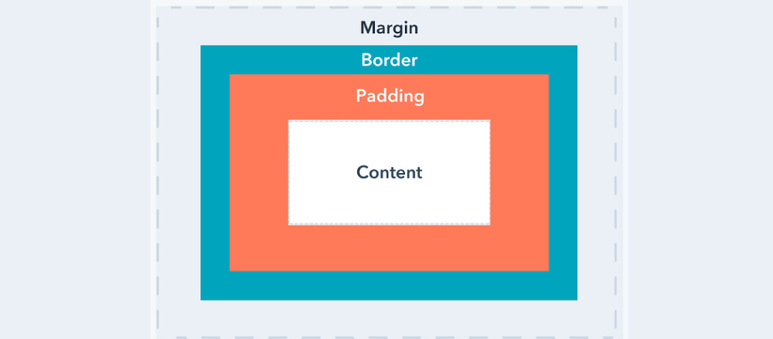
Smartphone screens are small, that doesn’t mean that you have to use small text with less space. By doing this, text & other content can be overlapped over the various device which is visually too much disturbance. Allowing enough spacing & line height helps to boost user legibility. As mobile technology is blooming daily, designers must incorporate new trends while developing UX design. As an example, a curved display requires more padding than a general display to avoid unnecessary finger touch. 16pt is the minimum & statement recommendation for padding
Providing a better user experience is the ultimate solution to retain a long-lasting impression of your user. You need to ensure a great mobile UX design that promotes your brand’s vision. In this article, we have mentioned those UX best practices that have been recommended by various UX designers & developers. This will affect your business as a whole with app popularity to get a positive ROI.
Do you need any help related to designing mobile applications with minimal cost? Get in touch with us & know more.
Royex Technologies is the leading mobile application development & design company in Dubai providing website development, e-commerce & mobile application development in all scales with quality & flexibility. We have already developed more than hundreds of mobile apps in IOS, Android, native, and html5 cross-platform apps to provide to our clients. Visit our portfolio & connect with us for further details.